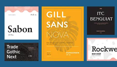
Typography is one of those design elements you might not notice until it goes wrong. A website can have beautiful images, a polished logo, and an impressive layout, yet the wrong typeface can make the whole experience feel confusing, outdated, or strangely uncomfortable.
Think about the last time you opened an app and immediately understood where to click, what to read, and what mattered most. Chances are, typography was quietly doing a lot of the work.
From the fonts used in mobile apps and websites to the lettering on packaging, advertisements, presentations, and social media posts, typography shapes how we experience information. It can make a message feel professional, playful, serious, luxurious, friendly, or even urgent.
The good news is that you don’t need to be a professional designer to understand the basics. Once you know how different lettering styles work, you’ll start seeing typography everywhere—and making better design decisions yourself.
Why Typography Matters More Than You Think
Typography isn’t simply about choosing a font that looks attractive. It is about communication.
Imagine receiving an important message written in a decorative script font with elaborate curls and tiny letterforms. It might look beautiful, but reading a long paragraph would quickly become tiring. Now imagine a children’s educational app using a rigid, corporate-looking typeface. The information might be useful, but the visual style could make the experience feel unnecessarily serious.
Good typography creates a connection between the message and the person reading it.
Designers consider factors such as letter shape, spacing, size, weight, alignment, and contrast. Together, these details determine whether text feels easy to read and whether it fits the personality of a brand or project.
Typography also creates hierarchy. A large headline tells you where to begin. A smaller subheading provides context. Regular body text delivers the details. A bold phrase draws attention to something important.
In other words, typography helps guide your eyes.
Understanding the Major Typography Styles
There are thousands of typefaces available today, but most can be understood by looking at a few broad categories.
Serif Fonts: Traditional With a Modern Twist
Serif typefaces have small decorative strokes at the ends of letters. They are often associated with books, newspapers, editorial design, and established institutions.
If you’ve ever wondered what separates serif typefaces from their cleaner counterparts, understanding what is a serif font is a useful starting point.
Serifs can give a design a sense of history, sophistication, and authority. That’s one reason they’re popular in luxury branding, magazines, publishing, and professional communications.
But don’t assume serif fonts are automatically old-fashioned. Modern designers frequently pair traditional serif lettering with minimalist layouts, bold colors, and digital interfaces.
For example, a fashion brand might use a refined serif for its logo while using a simple sans serif for product descriptions. The combination feels elegant without sacrificing readability.
Sans Serif: Clean and Straightforward
Sans serif typefaces don’t have those decorative strokes. Their simpler shapes often create a clean, contemporary appearance.
You’ll see sans serif fonts everywhere in modern digital design because they can work particularly well in interfaces, dashboards, mobile applications, and websites.
Think about a banking app. Users don’t want to struggle with decorative lettering while checking their balance or transferring money. Clear typography makes the interface feel intuitive.
Sans serif doesn’t necessarily mean boring, either. Designers can adjust weight, spacing, proportions, and size to create completely different personalities.
A lightweight sans serif can feel elegant and minimal, while a heavy geometric version can feel bold and energetic.
Script and Handwritten Styles
Script fonts imitate handwriting or calligraphy. They can add personality and emotion to a design, which makes them popular for invitations, food packaging, fashion campaigns, and creative branding.
However, they’re best used strategically.
A script font might look fantastic in a short headline but become difficult to read when used across several paragraphs. If you have ever tried reading a full restaurant menu written in elaborate cursive, you probably know exactly what I mean.
Use these styles to add character rather than making them responsible for carrying large amounts of information.
Display Fonts: Designed to Get Attention
Display typefaces are usually created for headlines, posters, advertisements, logos, and other situations where making an impression matters more than reading large amounts of text.
They can be experimental, playful, futuristic, dramatic, or unusual.
Imagine a music festival poster. A conventional body font might communicate the event details perfectly, but a striking display typeface can capture the energy of the festival before someone reads a single word.
The important rule is simple: let display fonts have their moment, but don’t force them into places where readability matters more.
Typography and the Digital Learning Experience
Typography has become especially important as more learning happens through screens.
Students now encounter information through online courses, educational apps, digital textbooks, presentations, interactive quizzes, and video platforms. In these environments, typography can influence how easily information is understood and remembered.
Consider an online lesson explaining a complicated scientific concept. If every section uses the same font size, weight, and spacing, the page can feel like a wall of information.
A thoughtful typographic hierarchy changes that experience. A clear headline introduces the subject, subheadings divide concepts into manageable sections, highlighted terms emphasize important vocabulary, and comfortable line spacing makes longer passages easier to follow.
Technology has also made personalized learning more accessible. Digital platforms can adjust text size, spacing, screen layouts, and other visual elements to suit different learners.
This is an important reminder: good typography isn’t just about aesthetics. It can support accessibility and reduce unnecessary friction when people are trying to absorb information.
Choosing Fonts That Work Together
One of the easiest ways to improve your designs is to stop thinking about fonts individually and start thinking about combinations.
You don’t need five different typefaces to make a design interesting. In many cases, two complementary fonts are more than enough.
A common approach is pairing a distinctive headline typeface with a highly readable body typeface. For example, a serif headline can create an editorial feel while a sans serif body font keeps the content modern and easy to scan.
You can also create contrast using weight rather than completely different fonts. A single type family might offer light, regular, medium, semibold, and bold variations. Using these thoughtfully can create a strong visual hierarchy without making the design feel chaotic.
When choosing combinations, ask yourself:
- Do the fonts have enough contrast to create hierarchy?
- Are both fonts easy to read at their intended sizes?
- Do their personalities match the message?
- Do they still work well on smaller screens?
If the answer to those questions is yes, you’re probably heading in the right direction.
The Role of Spacing in Good Typography
Here’s a design detail that is easy to overlook: sometimes the problem isn’t the font. It’s the spacing.
Letter spacing, line spacing, and the space between paragraphs can dramatically change how text feels.
A headline with extremely tight spacing can look cramped. Excessive spacing can make it feel disconnected. Similarly, paragraphs with very little line height can become exhausting to read, especially on mobile devices.
Imagine reading a long article on your phone where every line is packed tightly against the next. Even if the typeface itself is excellent, you’ll probably lose interest quickly.
Good spacing gives content room to breathe.
This is particularly important in responsive design. A typography choice that looks perfect on a large desktop monitor may feel crowded on a smartphone. Designers therefore need to consider how type behaves across different screen sizes.
Typography Builds Brand Personality
Think about some of the brands you recognize instantly. Their identity probably isn’t based on color alone.
Typography can become part of a brand’s personality.
A technology company may choose geometric, minimal lettering to communicate innovation. A luxury company might use elegant serif typography to suggest sophistication. A children’s brand could choose rounded, friendly lettering to create a sense of fun.
The key is consistency.
If a brand uses one visual language on its website, another on social media, and something completely different in its email campaigns, the audience may struggle to recognize it.
Consistent typography creates familiarity. Over time, people can begin associating particular visual characteristics with a brand—even before they consciously read the words.
Practical Tips for Better Typography
If you’re creating your own designs, you don’t need to memorize hundreds of typography rules. Start with a few practical habits.
First, prioritize readability. A beautiful font isn’t useful if people can’t comfortably read it.
Second, establish hierarchy. Make it obvious what is a headline, what is supporting information, and what is the main content.
Third, avoid using too many fonts. A small, intentional selection usually produces a more professional result.
Finally, test your typography in context. Don’t judge a font only inside a design application. Put it on an actual webpage, presentation, poster, or social media graphic and see how it feels.
You might discover that a typeface you loved in isolation doesn’t work nearly as well when surrounded by real content.
The Future of Typography Is More Flexible
Modern technology is changing typography in interesting ways. Designers have access to huge digital font libraries, variable fonts, responsive design systems, artificial intelligence tools, and platforms that make professional design accessible to almost everyone.
Variable fonts, for example, allow designers to adjust characteristics such as weight and width more flexibly within a single font file. This can give digital experiences greater control while helping maintain performance.
AI-powered design tools are also making experimentation faster. Someone without years of design experience can now explore different visual directions, test typography combinations, and create polished layouts in a fraction of the time it once required.
But technology doesn’t replace judgment.
A tool can suggest a font, but it can’t always understand whether that font feels appropriate for your audience, industry, or message. Human context still matters.
Final Thoughts
Typography may begin with letters, but it is really about people.
Every font choice affects how someone encounters your message. It can make information easier to understand, help a brand become recognizable, create emotional associations, or encourage someone to keep reading.
The next time you design a presentation, website, social media graphic, or learning resource, don’t treat typography as something you add at the end. Think about it from the beginning.
Choose typefaces with a purpose. Create clear hierarchy. Give your text enough space. Test everything on different screens. Most importantly, ask yourself how the person on the other side of the design will experience it.
When typography works well, people don’t have to think about it. They simply understand, connect, and keep going—and that’s often the clearest sign that your design is doing its job.